Thursday, 24 March 2016
Update: Ancillary Product and Filming
For refilming for the documentary, my teammate and I have scheduled in to film in the first tuesday of easter half term, and then a week on we are coming into school in order to edit the new footage into our documentary and then upload the final version of the documentary onto our blogs. As for amendments to ancillary products, that will be completed by next Friday.
Wednesday, 23 March 2016
Amendments to Documentary
After discussion with my teacher, it has been decided that some amendments should be made to my documentary in order to boost the quality of the video. After the discussion with my teacher and the feedback below, I have decided the amendments that need to be made to this documentary are a narrative, which will add to the structure of the documentary. If we film someone involved with the interviews and show them in their home environment, it will give more of a personal feel to the film. After reviewing the feedback, the main downfall was that it lacked something more personal. This will hopefully give it the touch that it needs.
Below is the feedback for the documentary.
Do you find this documentary relatable?
Yes: 8 No: 2
Do you think its effective in being a social documentary?
Yes: 7 No: 3
Do you think it needs to be improved?
Yes: 4 No: 6
Do you feel like it needs more of a personal tint on it?
Yes: 6 No: 4
Would you watch this again?
Yes: 7 No: 3
Would you recommend your friends and family to watch this?
Yes: 8 No: 2
When asked more open ended questions, the audience feedback (target audience) tended to say that they found the content relatable as the characters within the documentary are fairly young. However, they said that it lacked some sort of a structure. Over the next few weeks, we will refilm and add this
Updated Draft of Ancillary Product

Using advice from my target audience feedback, I attempted to make amendments to my ancillary product. Firstly, I found a photo of some shopping bag on the internet and input it into my Photoshopped image.

I then found where within the poster that I wanted this image, and made it smaller and put it inside the poster.

I then used the filler tools in order to fill it in with the colour that corresponds with the rest of the poster- the blue associated with the ident within the documentary.

Below is the product after everything has been cut out, and it is effective because all of the white parts have gone. This makes it look realistic within the poster.

Here is the product after amendments have been made based upon audience feedback. This is all I planned on making with the final draft of the poster, so now all that is needed is my own version of the photo so there is no issue with copyright.

Friday, 18 March 2016
Audience reviews of Ancillary product
I showed my draft of my documentary poster to a variety of people within my target audience aged around 16-18 in my sixth form. Following is the feedback I received when I asked them the questions:
Do you think you would see something like this in a professional format?
Yes: 7 No: 3
Do you think this is effective in advertising a documentary?
Yes: 8 No: 2
Would you want to see the documentary based on this poster?
Yes: 6 No: 4
Do you think improvements could be made to make it more realistic?
Yes: 3 No: 7
Do you think it reinforces the genre of being a social documentary?
Yes: 9 No: 1
Is the design something easily followed?
Yes: 9 No: 1
Does this make you want to watch the documentary?
Yes: 7 No: 3
This feedback was very helpful, because it helped me to assess what I could change in order for it to fit better with my target audience. When asked, most of the audience said that if there was more things indicating it is a documentary about shopping, such as shopping bags faded into the background, it would be clearer about what it was about. Most of the positive verbal feedback I received was around the focal image being eye catching, and the typography differentiating within the poster. Based on this feedback, I am going to attempt to edit in some more shopping bags and make the genre more apparent.
Wednesday, 16 March 2016
Making Of Documentary Poster Mock Up
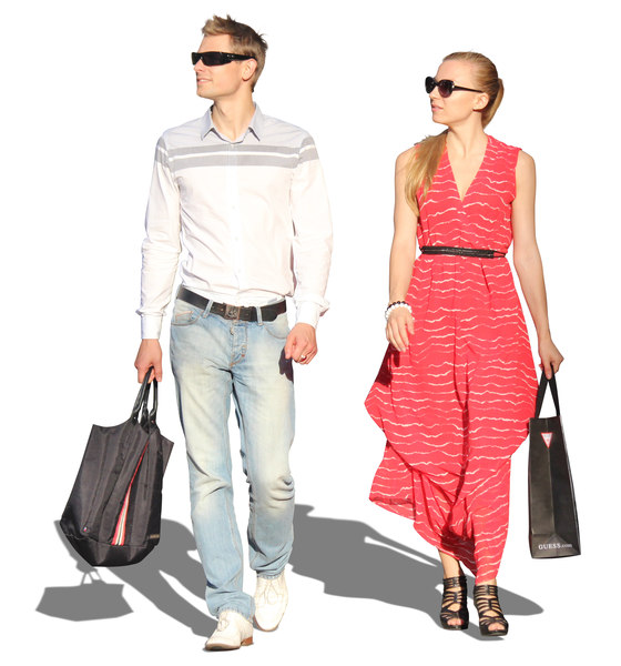
Here is the process of the making of the first draft of my ancillary product, which is a poster advertising my documentary. Firstly I found an image online of two people shopping, and opened the image on photoshop, as displayed below. This photo had a white background which showed itself to be a bit of an inconvenience. I needed to get rid of this and cut out the white background, and so I cut it out with a 'magic wand' tool and deleted out the white background.


After this, I went onto google images again and found a photo of four stars, put it onto photoshop and used the magic wand tool again to make the background of it the same as the rest of the poster. This provides some sort of a professional air around the poster, and changes it from something homemade to be something that is actually within the industry.

Overall, I am happy with my progress so far because I think it is starting to come across as a fairly professional poster for a documentary, with a focal image, colour theme and various typography.

Below is the product of cutting out the white background, and using the magic wand tool to cut out the extra white sections such as the ones between the legs of the male and next to the arm of the female. I chose this image to be used because I think it portrays a good demonstration that both males and females go shopping, as this is something shown in our documentary. These people are also quite young, and this helps because the target audience for our documentary is young people, and also the interviewees involved with our documentary are in a young age range.

I then decided that the blue within the background image of our ident at the start of the documentary would be a good colour to make the documentary, firstly because it will help the target audience to identify what it is, and it links it well with the documentary itself. I did this by using the colour picker tool, and this chose out the blue used in the background of the ident. I used this tool to then move onto a colour filler, and this went onto the background of the poster, as shown below. I feel like this is better than a white background because it isn't monochromic, and it serves well for either white or black typing.

I then went to the start of the documentary and screenshotted the ident, and placed it into the poster. This served well to go into the corner, because it doesn't distract the attention of the focal image, but is still prominent within the poster.

I then experimented with various typography within photoshop, and decided on using a couple of different fonts as this provides some sort of a difference and keeps the poster interesting. I also included the cast, which is the credits.

After this, I went onto google images again and found a photo of four stars, put it onto photoshop and used the magic wand tool again to make the background of it the same as the rest of the poster. This provides some sort of a professional air around the poster, and changes it from something homemade to be something that is actually within the industry.

Overall, I am happy with my progress so far because I think it is starting to come across as a fairly professional poster for a documentary, with a focal image, colour theme and various typography.
Tuesday, 15 March 2016
Making First Draft of Poster
 Here is my run-through of the making of my first draft of my documentary poster. Firstly, I have looked online and attempted to find some photos of people shopping to use as the focal image, and narrowed it down to the following through. They all made it to the last few photos because they contain bright colours which are eye-catching to the audience and can all fit into a colour scheme.

These are all fairly bright and would work for any sort of colour scheme I would want within a magazine cover. After this, it is a matter of choosing one of these photos to use as the focal image for my ancillary product. Once this has been done, i can use it as the base within photoshop and edit all the typography and colour scheme around the edge of it. I want the content of this to be 'Fryacke media presents..' in white or black font. The eye-catching title, which will be the same colour as the dress as the woman to keep with the colour code. If the poster has a colour scheme, it will make the audience think that it is a normal poster because it contains conventions such as a colour scheme. We will also need to take into account things like credits, and these will be obtained through using an application such as LiveType or photoshop, which is the app which I'm going to make the ancillary product on.
Tuesday, 8 March 2016
Rough Draft Idea for Poster

More key themes and conventions within magazine covers and posters are the typography. I would make the typography fairly plain so it wouldn't take away any attention from the focal image, but I would keep it within the colour theme to add to the audience attention catching. I have also included the credits, because they are helpful for informing the audience with who was involved with the making of the film. These typography will include the producers of the documentary, the editors, who was involved with the casting (interviewees) and more. This will act as a good advertisement for the documentary because it shows the content. I have also included a star rating system, because these are typically involved within posters for documentaries. If this contains a high level of stars, it means the audience are probably more likely to watch the documentary advertised because it will be more universally renowned if it has a high star rating system.
Lastly, I have included the name of the company within the poster, because it is both good advertisement for the company (Fraycke media) but it also informs the audience for what they should expect from the documentary. For example, if an audience saw a poster for a documentary by the BBC and narrated by David Attenborough, they would have specific expectations.
Monday, 7 March 2016
Double Page Spread Research 1
For one of my ancillary products, I am going to make a magazine double page spread on my documentary 'Pocket Money'. To conduct this, I will evaluate a couple of double page spreads and this will help me to have in-depth knowledge on the conventions of double page spreads and this will allow me to make my double page spread fit with the normal conventions of documentary double page spreads for a newspaper.

This double-page spread contains one large image, which attracts the audience's attention. This image is of someone famous and advertises who stars in the interview. This helps them to obtain more information about the characters. The text being present in columns in a newspaper style helps to reaffirm the narrative of being a double newspaper spread, and I want to include this convention within my ancillary product. With a main focal image, similar to my research conducted into the conventions of magazines and posters and advertisements, there tends to be a colour scheme (which in this case is neutral colours with black and white typography and backdrop). The only conventions slightly different than my previous research is the column-style writing and the typographies, which are conventions to take into mind when it comes to the making of my double page spread.
This double-page spread contains one large image, which attracts the audience's attention. This image is of someone famous and advertises who stars in the interview. This helps them to obtain more information about the characters. The text being present in columns in a newspaper style helps to reaffirm the narrative of being a double newspaper spread, and I want to include this convention within my ancillary product. With a main focal image, similar to my research conducted into the conventions of magazines and posters and advertisements, there tends to be a colour scheme (which in this case is neutral colours with black and white typography and backdrop). The only conventions slightly different than my previous research is the column-style writing and the typographies, which are conventions to take into mind when it comes to the making of my double page spread.
Ancillary Product Research Summary
Overall, I have found the main conventions featured within magazine and posters which are used to promote films. I am going to use this research when making my ancillary products, because I know that things such as an eye catching focal image, keeping a colour theme and making sure the typography contains titles that will attract attention and aren't too over the top with the font are all things that will mean people will want to buy the magazine or poster. Keeping a fairly large focal image which seems to cover the vast majority of the poster or magazine cover will fit within these main conventions. Also, keeping the typography simple yet eye catching and short but sweet will really be the determining factor as to whether or not something will sell. I am going to use this extensive knowledge to my benefit and use it when making my ancillary product.
Ancillary Product (Research) Specific Genre Magazine Analysis 3
My last magazine cover analysis will be a magazine cover that isn't a documentary, in order to show the variation within magazine covers and this research will allow me to broaden my knowledge of the conventions of general magazine covers. My choice for my third and final analysis is a magazine called 'total film', and they are advertising the film Star Trek, which was released in 2009, so fairly recent.
Firstly, the thing that is eye catching is the elements of red within this film magazine cover. The colours of the man in the focal image is black and white. Whilst that is fairly eye catching on its own as it features a conventionally handsome male who is the lead actor of the film, the main eye catching thing about this magazine cover is the red features of the typography. This works well because everything else is in monochrome shades, so the one bright colour makes you more prone to want to look at the cover and therefore look more into the films being advertised.
The typography of this magazine cover is also eye-catching: lots of the words, such as 'the boldest and coolest film of 2009', makes the audience want to read more. If a film is advertised as being the coolest film, it is something people might want to see because they want to keep up with the conventions of being 'cool and mainstream' within society.
The main focal image is eye-catching because it contains the conventions of being a photo of a main actor within the film. The jawline of this male is particularly defined and this helps to accentuate the film being advertised.
Ancillary Product (Research) Specific Genre Magazine Analysis 2
Here is my second documentary magazine analysis that relates with the ancillary product I plan to make. It has the focal image, which is a baby, slightly to the right. The typography on this magazine cover is slightly subtler than the previous one; the colours are all very neutral and therefore don't stand out as a result of this. The eye-catching title of 'this baby will live to be 120' stands out because it is an abnormality against society as people usually live until the age of around eighty, so this might be the main documenting thing that attracts the attention of the audience. The baby's skin has also clearly been photoshopped, as the skin on the baby is much clearer than that of a normal baby. This may attract the attention of people. As we live in a consumerist society where everyone is constantly attempting to better themselves, this may catch the eyes of someone who idealises the idea of perfect skin, as this baby seemingly has a lack of imperfections. This helps to promote the magazine, because having something that will catch the attention of many people will probably help the magazine to sell more copies.
The main convention of magazine covers for documentaries are that they stay predominantly natural, and National Geographic have seemingly succeeded at this. Having a focal image of a baby with not much else going on in the background and keeping the typography with neutral shades helps to keep the natural feel of the magazine and the articles within it.

The main convention of magazine covers for documentaries are that they stay predominantly natural, and National Geographic have seemingly succeeded at this. Having a focal image of a baby with not much else going on in the background and keeping the typography with neutral shades helps to keep the natural feel of the magazine and the articles within it.
Friday, 4 March 2016
Ancillary Product (Research) Specific Genre Magazine Analysis 1
Alongside making a poster for my ancillary product, I also have to make a magazine cover to advertise my upcoming documentary. Using magazines such as real life magazines and national geographic will help for this, because they tend to advertise up and coming documentaries. This supports the documentary we are making because we would need some sort of promotion, and these ancillary products would help with this.
For my first analysis, I am going to analyse a magazine cover from the magazine 'National Geographic', a world renowned company, and this would be the sort of advertisement we would like for our product.
 Firstly, this magazine cover has a lot of emphasis within the typography. The titles, 'National Geographic', a universally recognisable title, is at the top of the cover, fitting magazine cover conventions. The white title matches the colour schemes of the icebergs within the focal image of the cover. There is also a large title saying about the 'big thaw', and this sets the theme of nature within the documentary magazine cover. The main part of a documentary is within the title; to document something. This magazine cover advertises the things it is going to document within the magazine, and this sets the standards for what the audience can expect within the magazine. The colour scheme is mainly white and blue, which matches the sea within the focal image. These colours all going together matches the conventions of a magazine colour, and then surrounded and bordered by the conventional and distinctive yellow that you tend to see within national geographic magazine covers.
The focal image within this magazine cover shows some icebergs, with the blue sea and a person overlooking the situation. This focal image goes slightly against archetypal magazine features, because it doesn't feature on key thing, but a few different aspects that are all eye catching. This shows that there is a wide range of things within the magazine that are eye catching and can entertain the audience.
Overall, this poster is very eye catching for a variety of reasons that contribute; the colour scheme, eye-catching titles and the one person being a key focus of attention. This is good for a documentary magazine cover because it catches the eye of the audience, advertises lots of the information which is inside, and still doesn't look over done.
For my first analysis, I am going to analyse a magazine cover from the magazine 'National Geographic', a world renowned company, and this would be the sort of advertisement we would like for our product.

The focal image within this magazine cover shows some icebergs, with the blue sea and a person overlooking the situation. This focal image goes slightly against archetypal magazine features, because it doesn't feature on key thing, but a few different aspects that are all eye catching. This shows that there is a wide range of things within the magazine that are eye catching and can entertain the audience.
Overall, this poster is very eye catching for a variety of reasons that contribute; the colour scheme, eye-catching titles and the one person being a key focus of attention. This is good for a documentary magazine cover because it catches the eye of the audience, advertises lots of the information which is inside, and still doesn't look over done.
Wednesday, 2 March 2016
Ancillary Products (Research) - Specific Genre Poster Analysis 3
Here is another poster which I'm going to analyse. This one differs from the other analysis I have made, because it features people. This relates to the documentary I have made, because it involves people and their day to day lives. This poster is more similar to that of a film poster, because it contains a main focal image of people, whereas the other one only contained animals, and aspects of nature.
The colour scheme for this documentary poster is very bright, which is eye catching for the audience. Usually, lots of race cars are yellow, such as Ferraris and lamborghinis. This colour scheme may catch the eye of the audience, because it relates to the genre of the documentary, which is all about racing car drivers.
'Senna', which is a mixture of being a documentary and some acted, features a main actor. This actor is in the main focal image. This main focal image is very eye catching, because the actor appears to be very reflective upon life. The typography, which matches the yellow colour scheme, tells you that this film won a Sundance award, which is a universally recognised award. This may cause the target audience to want to watch it more, as film critics have agreed that this is a good film.

Instead of this film relying on a star rating system which is what most films do, it doesn't have one of these because it is a documentary over being a feature film. This presents the individualistic attitudes in which the documentary presents. The typography includes the coming out date for the film, and this creates anticipation for the audience. The quote, which says 'he was the best driver who ever lived', shows his importance within the world of racing. This, alongside the colour scheme of yellow which is archetypically associated with racing cars, shows the importance of the starring character 'Senna', within the racing world. This gives the audience information that if they want to claim that they know a lot about racing drivers, they should see this film.
The colour scheme for this documentary poster is very bright, which is eye catching for the audience. Usually, lots of race cars are yellow, such as Ferraris and lamborghinis. This colour scheme may catch the eye of the audience, because it relates to the genre of the documentary, which is all about racing car drivers.
'Senna', which is a mixture of being a documentary and some acted, features a main actor. This actor is in the main focal image. This main focal image is very eye catching, because the actor appears to be very reflective upon life. The typography, which matches the yellow colour scheme, tells you that this film won a Sundance award, which is a universally recognised award. This may cause the target audience to want to watch it more, as film critics have agreed that this is a good film.
Instead of this film relying on a star rating system which is what most films do, it doesn't have one of these because it is a documentary over being a feature film. This presents the individualistic attitudes in which the documentary presents. The typography includes the coming out date for the film, and this creates anticipation for the audience. The quote, which says 'he was the best driver who ever lived', shows his importance within the world of racing. This, alongside the colour scheme of yellow which is archetypically associated with racing cars, shows the importance of the starring character 'Senna', within the racing world. This gives the audience information that if they want to claim that they know a lot about racing drivers, they should see this film.
Tuesday, 1 March 2016
Ancillary Products (Research) - Specific Genre Poster Analysis 2
Here is my second analysis of a documentary that is something similar to the kind of ancillary product I would like to make that relates with a documentary. The main difference between the type of documentary advertised on this poster compared with the documentary I have made is that the documentary I have made doesn't involve nature. However, this is something that I can focus on the differences with- I will still include a colour theme, but instead of it involving nature, I will try and make it similar to the colours of popular high street shops.
Firstly, the colour theme on this documentary is very nature oriented- most of the colours are white, navy and green, which all revolve around the main focal image. This colour scheme again accentuates the natural theme of the documentary.

Within the typography, at the top it advertises who made the documentary, which is the BBC. These are world renowned for being famous for making documentaries, and this helps to promote the documentary as being something that is well known. It tells the audience the title of the documentary, which is 'Planet Earth', and advertises who made the music, which is George Fenton. This goes against usual archetypes, because normal documentary posters have much more credits than this one.
The focal image, which is some animals, and the image has been edited to make it look like the edge of the world.
The differentiation between the birds and other animals (buffalo) provides a good range of both colour, and provides the audience with something with an interesting contrast. This helps to build audience anticipation for the documentary.
Firstly, the colour theme on this documentary is very nature oriented- most of the colours are white, navy and green, which all revolve around the main focal image. This colour scheme again accentuates the natural theme of the documentary.
Within the typography, at the top it advertises who made the documentary, which is the BBC. These are world renowned for being famous for making documentaries, and this helps to promote the documentary as being something that is well known. It tells the audience the title of the documentary, which is 'Planet Earth', and advertises who made the music, which is George Fenton. This goes against usual archetypes, because normal documentary posters have much more credits than this one.
The focal image, which is some animals, and the image has been edited to make it look like the edge of the world.
The differentiation between the birds and other animals (buffalo) provides a good range of both colour, and provides the audience with something with an interesting contrast. This helps to build audience anticipation for the documentary.
Ancillary Products (Research) - Specific Genre Poster Analysis 1
I am going to analyse a documentary poster, because this is similar to what I would like to make for my ancillary product. I will make this clear through a variety of features, such as the iconography of the poster and the typography. Here is a copy of a poster advertising 'The March of the Penguins', which was a documentary made in 2005, by French documentary makers.

The colour scheme of this poster is mainly grays and monochromal themes, which matches with the penguins, which are the main theme of both the poster and documentary film. This helps to keep the themes of the documentary. The fact that there is a small amount of yellow and orange in the penguins in the focal image and a small amount of orange typography is another feature of the colour scheme; these small flashes of colours are eye-catching and accentuate one another. This also keeps the poster very natural, because keeping it to the natural aspects shows the rawness, unedited, natural theme of a documentary.
The bold typography is one of the main attention-seeking aspects of this documentary. This draws in the attention of the audience, and informs them on what this documentary entails. This is an effective aspect of the poster, because it isn't too bold, but enough to be eye-catching. This is engaging, and again fits in with the colour scheme which accentuates the natural theme of the poster. None of the colours within the background of the focal image or typography is something that wouldn't occur within nature.
At the bottom, this poster has one of the main conventions of informing the audience on who was involved with making the documentary. This is kept in white at the bottom of the poster, so it doesn't divert attention from the main bold title of the bold focal image. In these credits, it tells the audience who was involved with the making and distribution of the documentary, and this is kept white and difficult to detect with the eye because the makers want to make it seem as natural and unedited as possible. This provides the feel of the documentary coming straight from the wild into the viewer's eyes.
The main focal image of two penguins is definitely the most eye catching aspect of the poster, There is a distinct lack of mise en scene, which again keeps the nature aspect of the documentary. This fits the conventions of being right in the middle of the poster. The colours being monochromal keeps the theme of being natural.
Subscribe to:
Comments (Atom)