 Here is my run-through of the making of my first draft of my documentary poster. Firstly, I have looked online and attempted to find some photos of people shopping to use as the focal image, and narrowed it down to the following through. They all made it to the last few photos because they contain bright colours which are eye-catching to the audience and can all fit into a colour scheme.

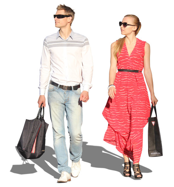
These are all fairly bright and would work for any sort of colour scheme I would want within a magazine cover. After this, it is a matter of choosing one of these photos to use as the focal image for my ancillary product. Once this has been done, i can use it as the base within photoshop and edit all the typography and colour scheme around the edge of it. I want the content of this to be 'Fryacke media presents..' in white or black font. The eye-catching title, which will be the same colour as the dress as the woman to keep with the colour code. If the poster has a colour scheme, it will make the audience think that it is a normal poster because it contains conventions such as a colour scheme. We will also need to take into account things like credits, and these will be obtained through using an application such as LiveType or photoshop, which is the app which I'm going to make the ancillary product on.
No comments:
Post a Comment